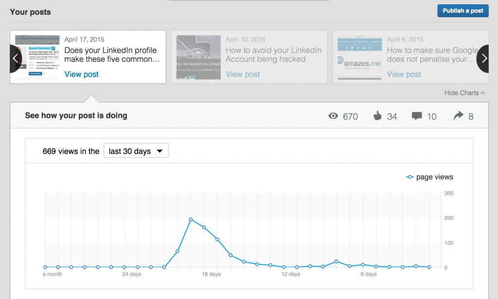
This past week, LinkedIn updated its Publishing platform. If you’re not familiar with the publishing. It is their version of blogging on the LinkedIn site. You can publish anything you want and on any topic related to business. It’s a great way to gain more attention on LinkedIn. I have used it for a few years. In fact, I published a post the day before this was released!
LinkedIn says the experience is sleek and less distracting to readers. This I will have to give them. Before, there were items on the left. These included your posts that have previously been published. The way they are doing it is making the main picture span the entire screen. One thing I noticed while trying it out on Friday. You can’t move a photo in the space. It crops the picture in the middle. You can click a button that will make it show up to fit the screen. This is something I hope they fix.
You can now load in rich media as well. It includes in-line images, videos, slides, podcasts, and more. The one that I love the most is the slides edition. This would be a great place to do a post after a speaking event. Cover the top points you made and post the slides. All too often when you go to an event, you never can track down the slides, or they get put up late.
Lastly, you can now use hashtags to tag your content. People will be able to search for the hashtag and find your content easier than before. Trying to search the published posts has always been something I avoided. Now, I think my content and others will be easily discoverable.
After trying it, I think they have some issues to fix. Overall, I think its a welcome addition. The functionality has greatly improved and can be easily searched. Other issues are cropping of pics, keyboard shortcuts and menu bar at the top. As I mentioned the main picture won’t let you fix an image in the wide format. It crops it directly in the middle. You will have to crop the pic before you upload.
While writing my post I kept trying to use keyboard shortcuts. Such as Bold and italic. None of them worked with LinkedIn. It would be great to have these added into the service. Many power users prefer it over the menu bar. It’s a minor issue but one that is a preference.
Lastly is the menu bar. It’s at the top of the screen. It’s an odd place for it. I wish they had it tied into the side or the text area itself. It was annoying to have to go to the top of the screen. It seemed anti-intuitive.
What does this mean to your business?
Probably not much for your business. But personally, you will be able to share your expertise and be seen as a thought leader. They need to roll this out for business profiles.


