 Typorama is an app that’s very similar to WordSwag. It allows you to create various sizes of images with text over them. Unlike WordSwag, Typorama will create images for all different social networks. It also will allow you to put a shadow behind your text so the words can be read against a background. There are a few more things that sets this app apart. It also has some drawbacks. But overall it’s a good app to have in your arsenal.

Open the App and you see the Welcome screen followed by the background images

When you open the app get a lot of preset background images. If you scroll down you can see more. If you are going to create a water mark use the transparent (more on that in this later in the tutorial) or you can select a picture in your camera roll. It is up to you which you choose. If you have a saying or quote, a preset background maybe good. Use your own image when you want to promote your product/service.

After you select your image you will see the “choose a size” at the bottom of the screen. The first three are social media, the next two are wallpaper options then it gives you different ratios to choose.

After you select a size, I choose Facebook, a crop window will show. Anything not in grey will be part of the image. One of the down sides is you aren’t able to adjust the image in the crop area. They have said they are working on this in a future update. However, if you have a picture where what you want is in the middle, like this one, its not an issue.

After you select your size the text window opens up. (Click on this image to make it larger). The top menu allows you to change Text styles, Tools, Filters, Overlay, Adjustments and Water marks. The middle are the different text types. The bottom let’s you pick a color and change the opacity of the text and the shadow. They are pretty easy to navigate

The Type window has a big area at the top that you can enter your text. Or, if you prefer you can enter a random quote.

Note that there is a character limit for the text. The bottom corner of the top box will let you know how much text you have left.

Tap the Style you want with your finger. If you keep tapping the same style it will change the layout of the style. They can range from wide to narrow. You will have to experiment and see what works best for your image. I like the narrow in the middle.

One thing I like best about this app is you can change the color and position of the shadow. There are some images that no matter what color you use the text won’t stand out. If you add in a shadow you can make the text pop. You can do a few things with the shadow. First you can change the color from black to any color in the picker. Next you can adjust the x and y axis to make the shadow more effective. Lastly is the opacity. You can make the shadow bold or more softer. This is work the price of the app!

Another feature is gradient text. When select the gradient you will get a preset. It may work like this one did or you can change the color. Click the “end color” and change it. The middle part of the bar will adjust the gradient if you want more or less of a color.
One thing I didn’t cover is the Eraser. It will erase parts of your text. You may want this if you want to make it appear the text is behind part of your image. I haven’t done this successfully yet so I didn’t show it. Feel free to play with it and see how it goes for you.

3D Text is another cool feature of the app. It can come in handy when you want to make the text appear to be part of the image. You can move your finger to adjust the perspective. This will take work to get just right. I didn’t have the knack for it. I”m still kind of wonky with it but I have used it a few times. When it works its pretty awesome! It’s just learning how to use it effectively.

There are other areas that you can use for your image. The first are filters. I prefer to use a third party app but its great to have this option in the app. The second are the Overlays. Some times they work and other times they don’t. I used one for a Vegas picture and it was perfect. I would use these sparingly and not over do it. Lastly you can adjust different aspects of the picture. Consider it photography editing in here with brightness and the like.

Adding a watermark is one of the easiest you can do. You can select an image or use a text one. If you choose an image they recommend you have one with a transparent background. A text one is super easy to add. Type in your watermark. You can change the text to one of the options and color.

After you have inserted your watermark you can move it to where you want it. You are not able to turn it side ways. Which is one thing i wish the app had. You can adjust the opacity and shadow of the water mark. I prefer to set my watermarks around 30% opacity. That way they are still legible but doesn’t distract from the image.

After your image is done you can save it via any preset setting listed. If you want to save to other apps you can click others. As long as its in your share sheet you can share it. I prefer to save it to my cameral roll then share it to the apps.
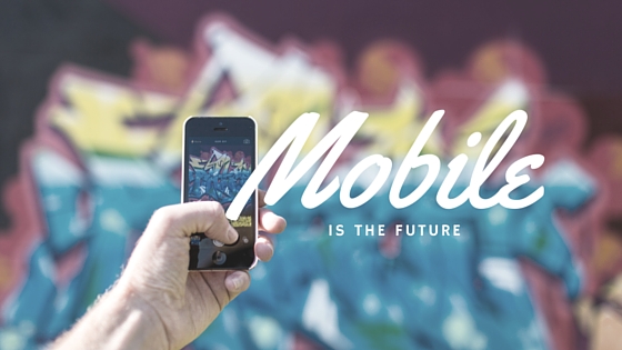
This is the final image I created!

It looks great with the gradient and shadow. I used the Snapped app to change the image to HDR picture before importing.
If you want you can see all the screen images on the Marketing Elements Facebook Page or Google Photos Album If you need a good image app I would recommend Apple